A nudge in the car to increase attention
It is not always clear if an intersection is dangerous or even if there is an acute risk of hitting somebody. Several in-car nudges have been developed that could help drivers increase their awareness.
Many accidents occur in intersections. There are of course statistics on which intersections are most dangerous, and it is even possible to use video cameras to locate crossing traffic in real time before an accident happens. This is potentially life-saving, but the information must somehow be transmitted to the driver if it is to make any sense.
One way of doing this is to nudge the driver; still preserving their freedom of choice. Early ideas about blocking the accelerator pedal were inevitably scrapped for the benefit of the nudges. The focus has instead been on presenting the information to the driver, so that they could make an informed decision.
Now wait, you may ask yourself. Informed decision and nudging; how does this add up? Well, it is certainly a bit away from the traditional subconscious nudge; the so-called type 1 nudge. Type 1 nudges appeal to subconscious mechanisms outside any active control and nudge humans into making a better decision without them knowing it.
What is used here is instead a type 2-nudge. A type 2 -nudge focuses on the conscious decision making, and makes a good decision more likely by providing relevant information. Marie-Christin Harre from OFFIS was one of those responsible for the nudge design, and is totally aware that this border is discussed.
“The ways you present this information will always be quite similar to an alarm. However, by explaining the situation longer before anything happens, we give the drivers more time to act and think on their own. An alarm may be presented just 1 or 2 seconds before the potential impact, whereas we start the nudge 5 seconds before”
There are three different designs for how such a nudge could look, and not so long ago there were six. They are all the results of an exploratory workshop and were all shown to potential drivers for feedback.
Most of the nudges relied on the type 2-principle of presenting the information directly, but there was one more abstract and nudgy design. It consisted of a colour-and shapeshifting circle. When a dangerous situation approached, it morphed away from the round smooth design if the drivers were going too fast. This idea was thought to appeal to humans’ love for smooth round shapes, but it didn’t really hold up in the end.
The morphing circle was not really understood; neither regarding what it meant, why it changed shape, nor what could be done to change it back. So no matter how much the drivers would want the smooth round circle to come back, they would not be able to subconsciously act upon it and make it round again.
Instead, it would evoke some weird complex of subconscious stimuli wanting to make the circle round, which in turn would have to appeal to active thoughts. No, it was clear that the people preferred the nudges they could actually understand.
It was also clear that drivers did not want nudges distracting them or obstructing the view, which is certainly a fundamental aspect in MeBeSafe. One design consisted of an intersection symbol mounted in a head-up display right over the real intersection, and this was not well received at all.
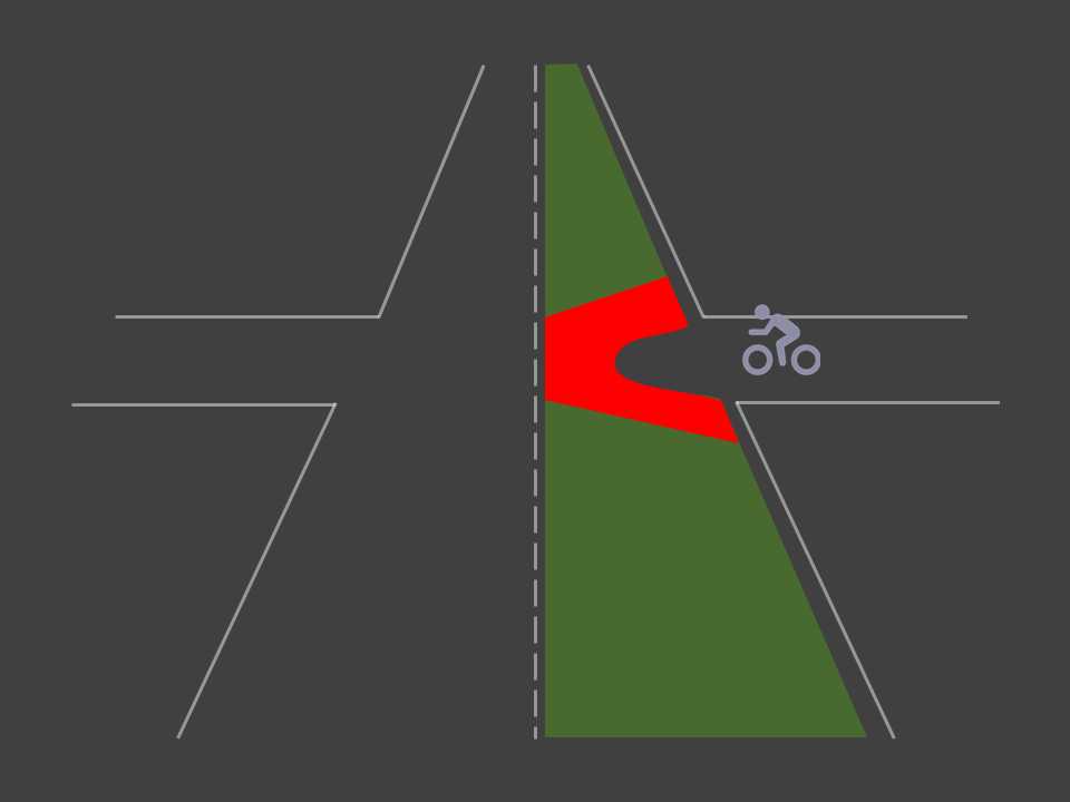
The most preferred nudge was actually rather similar, but yet fundamentally different. It is also found in a head-up display, but more moulded into reality.
Whereas the floating intersection symbol just hovered around over the intersection, this nudge follows the perspective actually seen. It consists of a green line following the road over an intersection, where it may turn red if the intersection is known to be dangerous and the driver is keeping an elevated speed. If a crossing cyclist appears, a notch in the line will appear from the same direction that the cyclist is coming from.
The very same illustration can also be mounted in the dashboard, which in fact is the second nudge. The dashboard could also be used to show a simple symbol of a red-coloured intersection, potentially indented for approaching cyclists. That is the third nudge.
Even though dashboard communication was less preferred and is easier to miss, one of these nudges may nevertheless end up as the finalist. It is as of yet very difficult for the car to analyse the surroundings in real-time, and then render the line precisely where the road is running. A single small error and the line will not follow the road, which most likely will make the nudge much less appreciated.
In a car simulator study, everything can of course be tried, and this is what is going on at the moment at CRF. All three designs will be evaluated in a simulator, and the results will then form the basis for the field trial implementation. Marie-Christin Harre is looking forward to the results and has a plan what to do.
“We believe that drivers will still prefer the head up-display image of an intersection, which we may not be able to test in a real car due to current technical restrictions. However, if we use the same image on the dashboard and test it that way and it works, we could say that when the technology is ready there is an even better alternative in waiting”.